Fomo Academy: The art of pitch decks #1. The stage deck

Elevate your on-stage pitching with a deck that supports your pitch, not confuses the audience.
My goal is to minimise the ineffective dance between founders and investors. Let the capital flow!
I'm an entrepreneur, designer, startup ecosystem builder and fundraising advisor. I have an extensive background in product and UX design, working on products at Booking.com, Glia, Smart-ID and many more. When I co-founded and led Remato as the CEO, I always thought that building a startup is just like a design project, but with a wider scope. That's what introduced me to the mindset of Investor Experience Design when we talk about fundraising and investor management.
I've raised three successful and oversubscribed rounds before, during and after Covid. For the past three years, I've personally helped dozens of founders fundraise, including designing their decks and financial models. Less hands-on, I've lectured and mentored close to a hundred more on the topic.
I'm also a board member of the Estonian Founders Society, and currently my main role is Managing Director of the Estonian Private Equity and Venture Capital Association (EstVCA), representing the Estonian PE & VC funds community, and the industry as a whole.
One deck doesn't fit all
People talk about ‘the pitch deck’ as one thing. In reality, there are several kinds, each with a different job.
A stage deck is what you use when pitching live. It's not meant to explain everything on its own, it supports the story you're telling verbally.
An intro deck (or sending deck) works asynchronously, without you present. It should be easy to scroll through on a phone and convey the key story in 30–60 seconds.
A reading deck is the longer, more detailed version for investors who want to go deeper across market, product, traction, business model, and financials after initial interest.
A sales deck may overlap with your startup story, but the audience and goal are different. You are selling the product to customers, not the company to investors. The value prop, emphasis, and proof points shift accordingly.
This article focuses on the first one: the stage deck.
If people are reading, they are not listening
A presentation deck is not there to replace your pitch. It is there to elevate it.
When you are presenting live, you are the hero, not your slides. The audience should be listening to you, not reading paragraphs from the screen. And what would be even worse is you reading from the screen. It's not karaoke.
The deck should act as visual support for the key points, not as a document competing with your voice. That means the deck should be simple, fast to understand, visually clean, easy to process from a distance, and focused on emphasis, not explanation.
The biggest mistake founders make
The most common mistake is trying to make one deck do everything.
Founders often take a deck that was meant to be emailed around and use it as a live presentation deck. The result is predictable: too much text, small fonts, crowded slides, duplicate messaging between what is spoken and what is written.
When that happens, the audience has to choose between listening to you and reading the slide. Usually, they end up doing neither properly.
A live presentation deck should not force the audience to read while you are talking.
What should be on the slide
For a presentation deck, the screen should contain only what helps the audience follow and remember the story. That usually means:
- a short title or a few keywords
- important numbers
- simple charts or graphs
- photos or product visuals
- anything else that is hard to deliver verbally
A presentation deck becomes much stronger when it includes visuals or information that are better understood instantly on screen than verbally.
The keywords or short title can also be a backup for you when you are losing your flow and don't remember what you were supposed to talk about next. It gives you the topic or direction and emphasises the key point. You will naturally tell your story on top of it, without reading slides or repeating what is already on the screen.
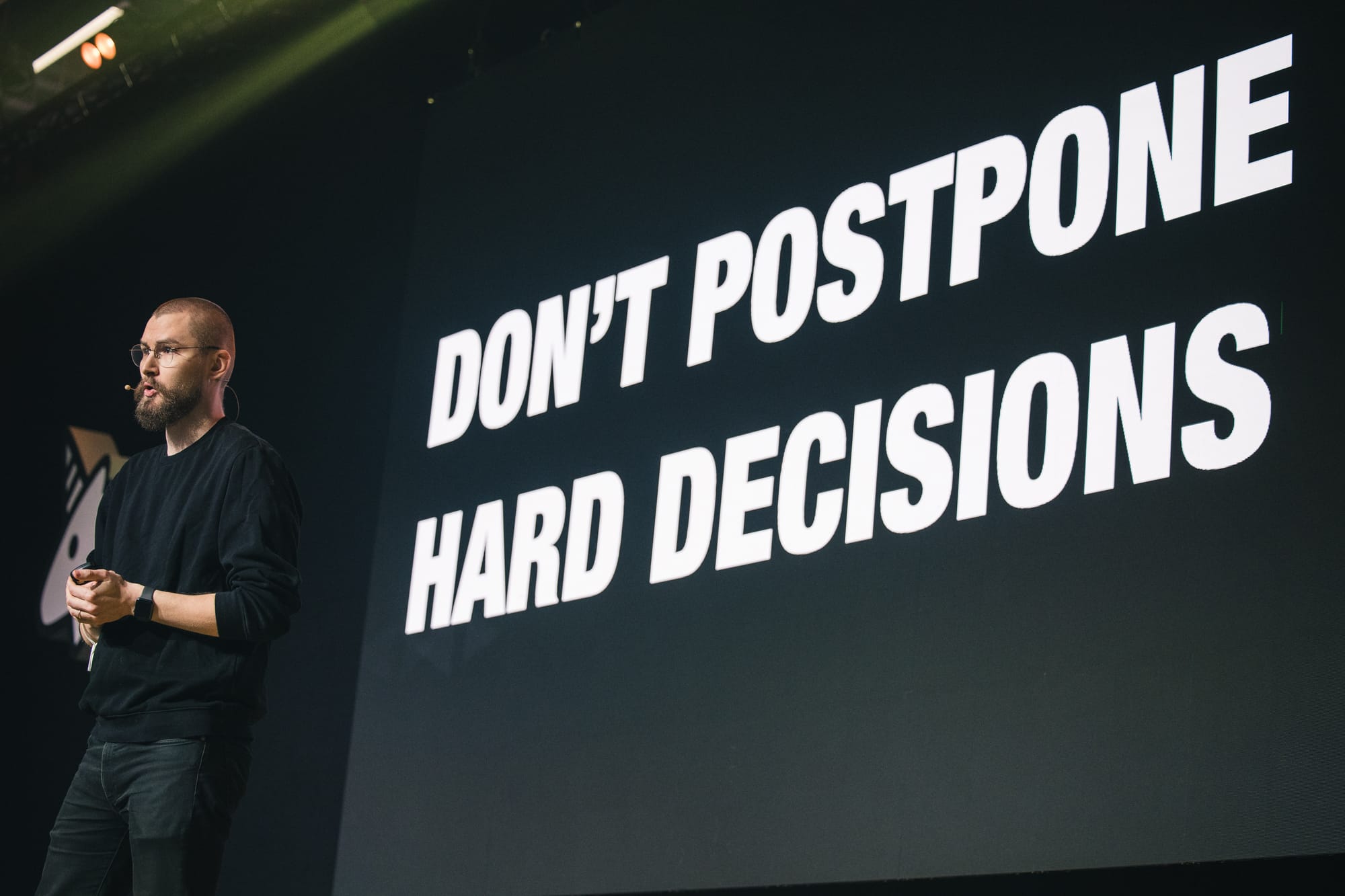
Another benefit of using short phrases or keywords as titles: once you switch slides, the audience automatically reads it in seconds. By the time you open your mouth, they have consumed it. For example, you can have a slide with only "$100B Problem" in the centre of the screen, then pause for a few seconds and start telling a quick story without any heads-up. The audience already expects a story that explains this $100B problem.
What to avoid at all costs
Paragraphs. Do not say the same thing in full sentences both verbally and on the slide. If you are already saying it, the slide should only reinforce it with a few keywords, if at all.
Avoid heavy data tables, long competitor comparison tables, or complex graphs. Tables are sometimes OK, but only when simplified. Graphs and charts can be great, but avoid tiny labels and too much data.
Avoid dense market research summaries, full customer case studies, or walls of TAM (Total Addressable Market)/SAM (Serviceable Addressable Market)/SOM (Serviceable Obtainable Market) text. Customer testimonials and case studies are great, but extract only the most important phrase or keywords, and tell the rest of the story verbally.
Your slides are not your notes. They are the audience's visual support.
Design matters more than founders think
A presentation deck is a performance tool. Design is not decoration. It directly affects comprehension.
Poor design creates friction:
- clutter
- weak hierarchy
- inconsistent layouts
- tiny text
- too many elements
- no clear visual priority
Good design helps the audience follow the story effortlessly. The cleaner the slide, the more confident the company appears. White slides with black text are always better than overdesigned, overdecorated ones.
Celebrate empty space
Empty space is great for presentation decks. The less information a slide has, the more important it makes the little that's on it. Think back to the "$100B Problem" example earlier. Empty space helps the audience to focus on what matters and listen to you.
A simple test before using the deck live
Ask yourself:
- Can this be understood from a distance?
- Can this be understood in under three seconds?
- Is this helping my spoken story or competing with it?
- Am I putting text here because it is useful, or because I am afraid to forget what to say?
- If I removed half the text, would the pitch get better?
A great and simple test for information density and text sizes is to check the deck on your phone. Skim through it without zooming in. That's roughly how it'll look to the audience in the back row.
Conclusion
A presentation deck should not try to do too much. Its role is simple: support the story and make the important things easier to grasp. If your audience is busy reading while you are speaking, the deck is working against you.
The best live pitch decks are usually the simplest ones. They don't explain everything — they make the story clearer, sharper, and easier to believe.
You are the hero.
This is part of a Fomo Academy Pitching Series where we will take you through how to present your pitch on stage and how to put together different pitch decks for pitch competitions, investor meetings and sales meetings.


Comments ()