Fomo Academy: The Art of Pitch Decks #2. The Sending Deck


The deck you send has to do the talking because you are not in the room. Here is how to make it work without you.
In the first part of this series, we covered the stage deck, the one you present live. This part is about its opposite: the deck you send.
There is no single pitch deck
People talk about 'the pitch deck' as one thing. In reality, there are several kinds, each with a different job.
A stage deck is what you use when pitching live. It is not meant to explain everything on its own, it supports the story you are telling verbally.
A sending deck (or intro deck) works asynchronously, without you present. It should be easy to scroll through on a phone and convey the key story in 30 to 60 seconds.
A reading deck is the longer, more detailed version for investors who want to go deeper across market, product, traction, business model, and financials after initial interest.
A sales deck may overlap with your startup story, but the audience and goal are different. You are selling the product to customers, not the company to investors. The value prop, emphasis, and proof points shift accordingly.
This article focuses on the second one: the sending deck.
Keep one deck, not four or more
At this point, you might be wondering how many versions of your deck you need. In an ideal world, you would tailor it for each investor, keep a longer version for detailed reading, and use a shorter one on stage. In practice, maintaining all those versions is nearly impossible. They quickly drift out of sync.
You usually know in advance when you are going to pitch on stage, so you have time to prepare the right version. Requests for a sending deck are less predictable. They can come after a networking event, an unexpected introduction, or a casual conversation with an investor at a friend’s birthday party. When someone says, “Send me your deck,” you want to have a strong, current version ready.
That is why the sending deck should be your master. It is built to stand on its own, so it already contains your whole story. Strip it back for a stage deck, reuse relevant material when building a sales deck, and expand selected sections when you need a more detailed reading deck.
It is your universal fallback: if only one deck is ever current, make it this one.
The deck that does the talking
The whole logic of the stage deck is that if people are reading, they are not listening. You are the hero, and the slides are the support.
The sending deck flips this. Nobody is listening. No voice, no story told over the slides, no pause for effect. Reading is the only thing happening.
So the slide stops being support and becomes the messenger. Everything essential has to be written out, or it does not exist. The deck does the talking.
The job is to get the meeting
A sending deck has one job. It is not to close the round. It is not to answer every question. It is to make an investor want the next conversation.
That changes what belongs in it. You are not trying to be complete, just clear, fast and interesting enough that someone replies and books a call. Hold the detail back. Detail is what the meetings are for, plus any longer materials like a reading deck, a whitepaper, or a financial model.
And once the deck gets you the call, do not expect a script. Some investors want you to walk them through the deck, some start asking questions in the first minute, some say outright they never want to see the deck again. Read the room and follow their lead. The deck got you here. The call is a different format with a different person every time.
It keeps working after the call too. The person inside the fund who liked you first still has to sell you to the rest of the team, in a room you are not in, and a deck that stands on its own makes that far easier for them.
Think about investor experience
Put yourself in their shoes. A partner might see hundreds of teams like yours in a short stretch, and the job trains them to say no to almost all of it. The default is no. Whoever opens your deck is, on some level, looking for a fast reason to move on.
So make their life easier. Help them decide quickly whether you are worth a closer look. Cover the pieces that matter, highlight what is most exciting about you and your startup, and remember that "exciting" is judged from their side of the table, not yours. The thing you are proudest of is often not the thing an investor leans in for. Lead with what is compelling to them, and leave out the fluff.
This is why I call it Investor Experience Design: the investor is the user, and the materials you send their way are the products they move through. It applies to financial models, monthly update emails, and pretty much everything. Don’t show everything, show what matters.
Design for the phone
Assume the first read happens on a phone, on the move, between meetings. That is your real format, not a laptop in a quiet office.
Keep the standard slide ratio. This is not about going vertical. It is about putting so little on each slide that it reads on a phone without zooming. What you are checking is whether a busy person scrolling gets the story before they lose interest.
If a slide needs zooming, pinching, or a second pass to understand, it is too dense for a sending deck.
Survive a 30 to 60 second skim
Assume you get only a couple of minutes of investors' attention and they decide within the first few seconds whether to keep going. Your deck has to survive a skim, not a study.
That means the narrative has to be obvious from the headlines alone. If someone reads only the title of each slide, from top to bottom, they should still understand what you do, why it matters, and why now. Everything else is reinforcement.
Tell a story, then fill the gaps
With no one narrating, the order of the slides is the narrative. Order matters more than completeness. Lead with a story or something impressive, then drop each topic in at the moment it makes sense, rather than marching through a fixed checklist. Topics do not map one to one onto slides either. Sometimes two sit comfortably on one slide. Sometimes one topic, like a layered problem, earns three.
I strongly disagree with people who tell founders to cap a deck at 10 to 12 slides. That rule forces you to cram things onto one slide that should never share a slide. If your problem is complex and has several layers, split it across several, each with one short clear title carrying that part of the problem. Do the same with market, business model, traction, etc.
Aim to stay around twenty slides, but treat that as a guide. A little beyond is fine if every slide still skims in seconds. Cognitive load per slide and the total time to scroll through matter far more than the count.
A useful way to think about the order is as four questions the reader is silently asking, in this rough sequence:
Why should I care? Intro, problem, solution, why now, value, early proof
How do you make money? Traction, business model, market, GTM
Why you? Competition, your unfair advantage, vision, team
How much? The ask, and a call to action
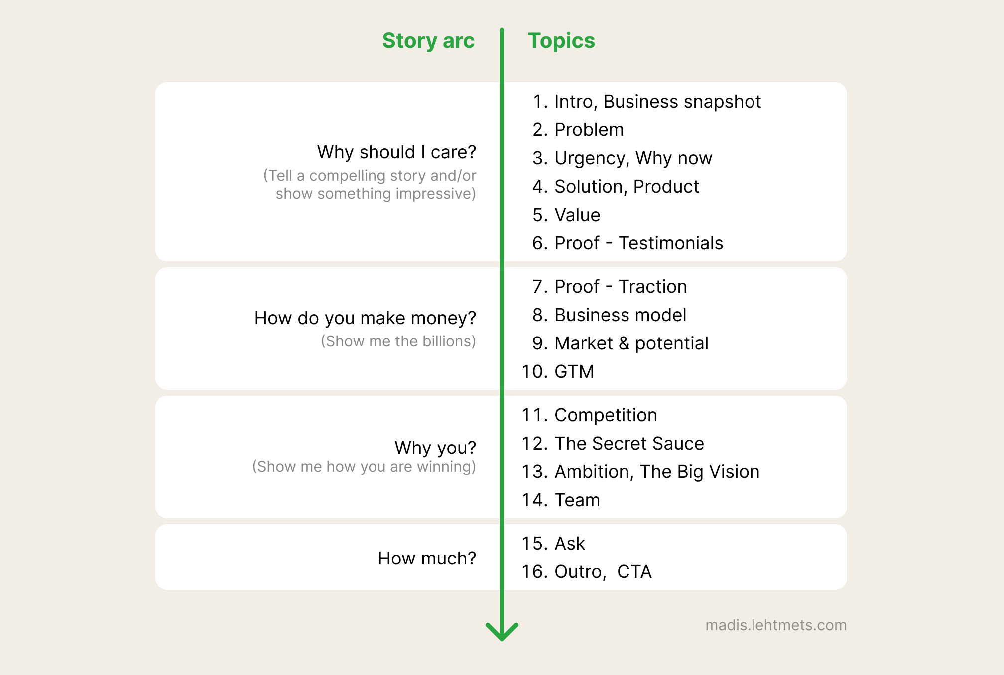
These four questions are scaffolding for you, not titles for the reader. They never appear in the deck. They keep the narrative honest while you decide what goes where, and the order is not fixed.
The first half carries more weight than the second. That is where you hook the reader and earn the rest of their attention, so the early story has to be tight. Once you are past the hook and into the numbers, you have more room to build.
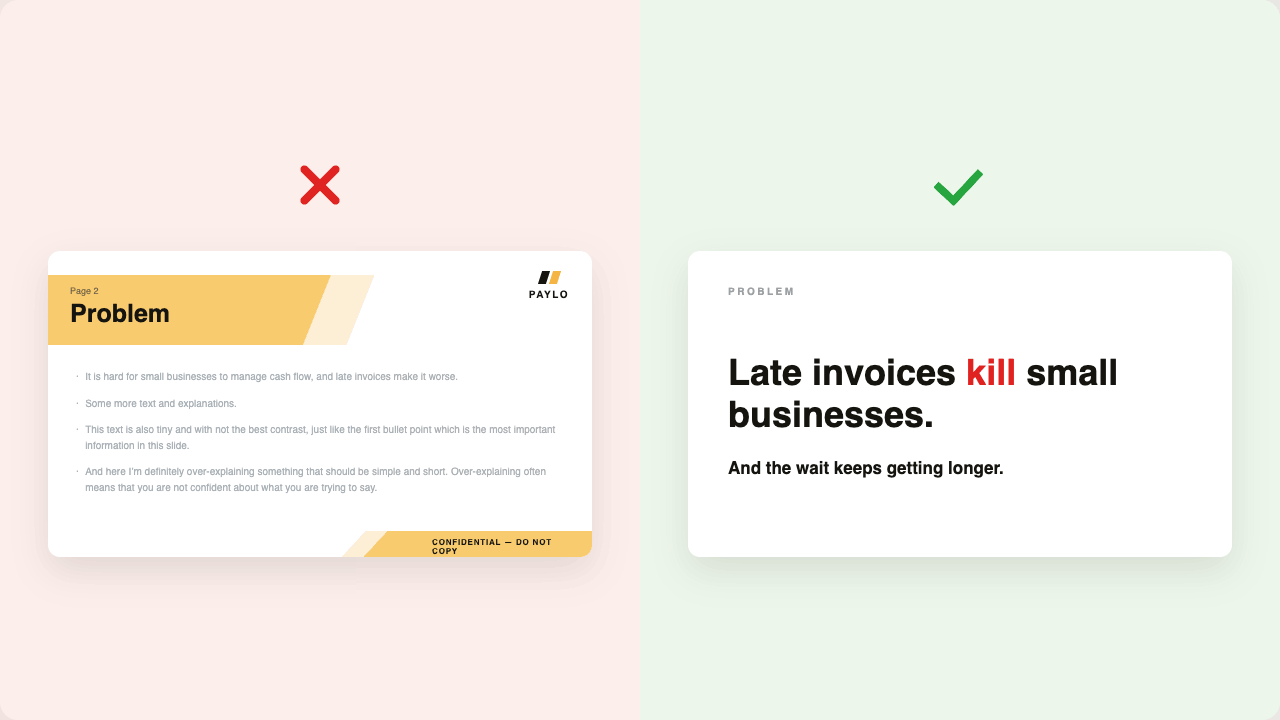
A title should make a point, not name a topic
The title is the most important text on the slide, so write it large and let it carry the main point. Done well, the titles alone carry the story even when the reader never touches the smaller text. If you are editing on a computer, push the font bigger than feels comfortable, then check it on your phone. What looks oversized on a laptop usually looks right in the hand, which is where it gets read.
The common mistake is spending that big title on a word that says nothing. On stage you could put 'Problem' on a slide and explain it out loud. In a sending deck, that slide just sits there in silence. 'Problem', 'Market', 'Traction' are labels. They name the topic and waste the most valuable space on the slide.
Instead, use the title to state the point. In one phrase or one short sentence, say what the problem actually is, name the market and how big it is, show the traction. You do not have to fit everything in. Pick the single most important and most impressive angle on that topic or metric, and let the rest of the slide support it.
Take a startup that runs payments and financing for freight carriers. The difference looks like this:
Problem becomes 'Carriers wait 45 days to get paid for a load they delivered in two'
Solution becomes 'Carriers get paid the day they deliver'
Market becomes '$120B freight payments market, growing 20% a year'
Business model becomes '3% on every payment processed, plus an annual platform license'
Traction becomes '$600M processed, $2.5M license ARR, up 250% year on year'
Read those five lines on their own, and you already understand the company. That is the test. The titles alone should pitch it.
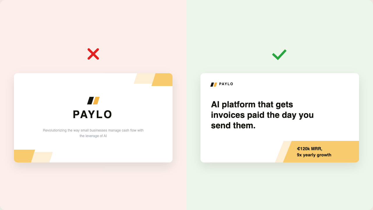
First slide is a snapshot of your business
The first slide decides whether the rest get read. On stage, your opening words make the first impression. Here there are no opening words, so the first slide makes it for you. You have the reader's full attention for a few seconds, and then it starts leaking. Spend it well.
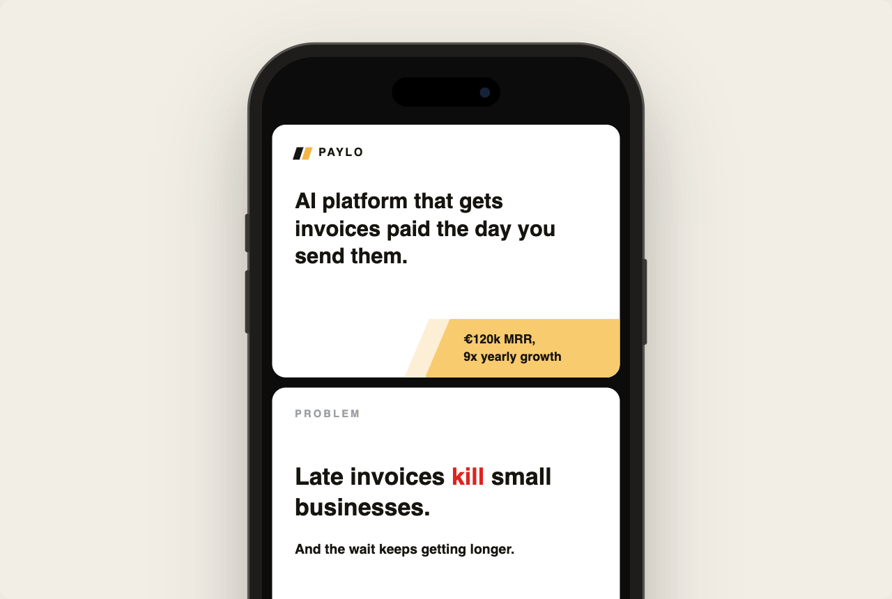
Do not give the whole slide to a logo and a company name. At the early stage, your brand is not worth much yet, and it tells the reader nothing. Say what you do in one clear sentence, big enough to be the first thing they read, and skip the empty hype words. 'Revolutionising the way small businesses manage cash flow' says nothing. 'AI platform that gets invoices paid the day you send them' says something.
Then show one impressive fact, ideally a number that signals both your stage and your speed. Investors see an enormous range of companies, and a line like '€120k MRR, 9x yearly growth' instantly tells them roughly where you are and how fast you are moving. Or if Google is your client, show it. If the founding team has 3x PhDs, show it. Too often, founders bury their most interesting number in tiny grey text on slide eleven, where nobody sees it. Put it up front. If you are pre-revenue and do not have a number like that yet, set the context another way, for example, 'Raising €500k pre-seed.'
Clear context also helps an investor place you. Plenty of passes have nothing to do with whether they like you or get the idea. They are practical: wrong stage, wrong sector, wrong geography, a portfolio conflict. A snapshot of what you do, your stage and your speed lets the right investor categorise you in seconds and see that you are for them. Make that decision easy and fast, not buried three slides deep. This saves everyone's time.
A good first slide is a snapshot of the business. It makes an impression, sets the context for everything that follows, and earns you the next slide.
Less is more
On a sending deck, the words carry everything, so a slide can hold a little more than a title alone. But only a little, and only what earns its place. When the title needs support, a couple of short bullets or a sentence or two is usually enough. Often a chart, a clean graph, an illustration of the product, or a small table does the job better than any sentence, and for numbers it is sometimes necessary. Decoration that carries no meaning is just noise, and design should elevate the content, not compete with it.
Density can climb as you go. A problem statement at the beginning wants to be nearly bare, while a traction or business-model slide can hold a paragraph, a chart, or a small table without feeling heavy. Let the content set the amount, and keep every slide skimmable.
Some slides can be nothing but a punchy title, and that emptiness is a feature. A near-empty slide gives the line real weight. Problem and solution statements are usually the best place for it. A single line like 'Late invoices kill small businesses' lands harder on its own than buried under four bullets explaining it.
Once a slide is ready, read it again as if every word you cut earns a few thousand toward your round. Less is more, but more effort.
Make it pitch itself
A test I like: read the whole deck out loud. If it sounds like a pitch, it is right. As the reader scrolls, the slides should read short, strong, and concise, so the deck quietly pitches itself in their inner voice.
Make it easy to share
A good sending deck travels. The partner you sent it to forwards it to the team. The angel who likes it sends it to a fund. Make that easy.
A good old PDF always works. A link works too, and gives you analytics on which slides people linger on. Both are fine. What to watch is friction. Anything between the reader and your story, like asking for an email before they can open the deck, is a risk. You can gate it, but with caution. I never would. I have not heard an argument for gatekeeping a sending deck that outweighs the cost of lower reach.
Your life gets easier the moment you accept that your deck will reach competitors and people you wouldn't send it directly to. In almost every case, the idea itself is not the valuable thing at this stage. Execution is. You have lived with these ideas for a while already. If someone hears about you late, copies you, and still out-executes you, they have earned it.
Two small things that help regardless: put your contact on the last slide so the deck carries its own next step wherever it lands, and name the file properly. Company name - one-liner - 2026.pdf is found again in a crowded inbox. deck_final_v3.pdf is not.
Test it on your phone before you send
Ask yourself:
Does this make sense with no one explaining it?
Can someone get the core story by reading only the headlines?
Would this survive a 40-second skim on a phone?
Is there a clear next step and a way to reach me?
Am I trying to get the meeting, or trying to win the whole round on slide seven?
The cleanest check is still the phone. Send the deck to yourself, open it on your phone, and scroll through it the way a tired investor would on a Sunday evening. If the story holds up like that, it will hold up anywhere.
Conclusion: Make it count
The sending deck is the version of you that shows up when you cannot. It has to carry the story alone, and leave the reader wanting the next conversation.
Keep it skimmable, make it exciting, and design it for the phone. Get this one deck right, keep it current, and every other version you ever need is a short edit away.
The deck is the only version of you in the room. Make sure it speaks well.
Madis Lehtmets is an entrepreneur, designer, startup ecosystem leader, and fundraising advisor. He has raised multiple oversubscribed rounds for his own startup and has helped dozens of founders build pitch decks, financial models, and fundraising narratives. He currently leads EstVCA and serves on the board of the Estonian Founders Society.
His approach to fundraising is based on Investor Experience Design: treating investors as users and every fundraising and investor-relations interaction as part of a deliberately designed experience.
This is part of a Fomo Academy Series where we take you through how to present your pitch on stage and how to put together different pitch decks for investors and pitch competitions.